[box]• The Independent published the 1st of these data visualizations in the article Invasion of the algorithms: The modern-day equations which can rule our lives on March 9, 2015[/box]
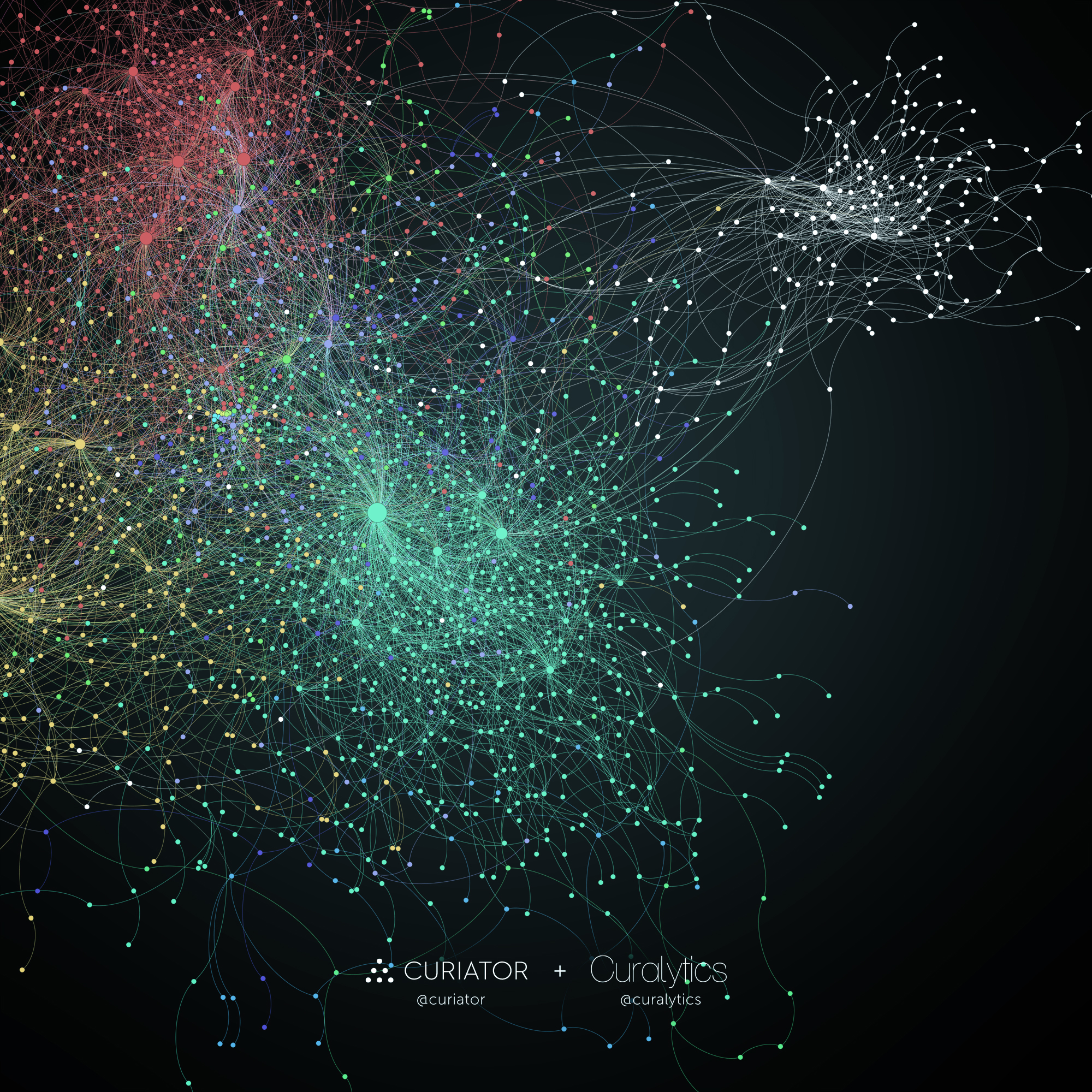
Big data and art don’t usually go together. Until now that is. Here at Curalytics, we’ve teamed up with Curiator, an art community, to provide big data analysis of their curation data. On Curiator, everyone is an art curator and creates their own collections of art in “rooms”. It is with these rooms of art that our analysis begins.
Curalytics, as the portmanteau implies, is a curation analytics service. We analyze curation data, such as curated rooms of art, and reveal insights about the community such as the taste groups and the taste leaders of those groups. These insights power advanced functionality and analytics.
With our shared enthusiasm for art, curation, and big data, Curalytics and Curiator have collaborated on an art project of our own: a visualization of the taste groups on Curiator. Using the rooms of art curated by their community, Curalytics applied curation analysis, identified the taste groups, and visualized the connections, resulting in a taste map:
A zoomed-out perspective:

About the taste map:
- Rooms that have art in common form taste groups.
- Lines connect similar rooms to taste groups which in turn connect to similar rooms.
- Colors highlight “macro” taste groups within the community. Like continents on a geographic map, the red, aqua-marine, yellow, and white masses reveal large affiliations of taste. The smaller clusters within the colored macro groups form the local “geographies” of taste: the countries, states, and townships of taste, if you will.
- Larger circles identify taste hubs that have a lot of connections. They are like the major cities on a map.
If you’d like to take a closer look, you can download a HD 2000x2000px version of 1st the taste map here and a HD 2000×1953 version of the 2nd one here. Thank you to Tobias from Curiator for help getting the data ready and to Moenen from Curiator for applying your design skills and making the visualization “pop”‘.
Click here to tweet this message: “See a visualization of curation analysis on art”


Dear Steffon,
I am starting a new web site on Big Data and Analytics Educational Resources and Research and would like to create an enticing head-of-page graphic illustrating some of the wonders of visualisation of small, medium and large data.
I have found your website at this URL http://steffondavis.com/visualizing-taste-in-art-with-big-data-curation-analysis-curalytics-and-curiator/
and would very much like to embody one of your pictures in the collage.
Would you be willing to allow me to use one of these? What attribution should I use, if you allow me?
Best Regards,
Richard J Self
Richard J Self BA LLM MBCS FHEA
Senior Lecturer in Analytics and Governance
Department of Computing and Maths, College of Engineering and Technology,
Room E516, University of Derby, Kedleston Road, Derby, DE22 1GB
Home Pages: http://computing.derby.ac.uk/wordpress/people-2/richard-j-self/
http://uk.linkedin.com/pub/richard-self/a/93a/829
Hi Richard – Thanks for writing in, I really appreciate it! I would be honored to have my image included in your collage for educational resources on Big Data if attribution can be included as well. Please attribute the image to Steffon Davis from Curalytics with my name “Steffon Davis” linking to my personal website (http://steffondavis.com) and “Curalytics” linking to my product responsible for the data presented (http://curalytics.com). Those two links would be perfect attribution. Best of luck with the resource, it sounds like a great idea! If you have a chance, it would be great if you posted the link to your resource back here when it’s ready: I think people would be interested (I know I am).
For anyone who would like to use this image in your work, feel free to ask. It’s also been used by The Independent (a UK publication) in one of the articles on big data (http://www.independent.co.uk/news/science/invasion-of-the-algorithms-the-modern-day-equations-which-can-rule-our-lives-10094518.html). They attributed the photo as well (although poorly. I’m pretty disappointed actually in how they did it).
If you’re a company that would like to license this image, or have your own data art created (even with your own data) feel free to reach out and we can come to an arrangement.