Square, the mobile payments company, has a new online marketplace for small businesses. This Holiday Season, they sponsored a competition for the most creative and diverse curated “wish list” of products. The prize: $1,000 worth of items from your list. Fortunately, mine was a top ten winner.
I’m passionate about curation and, when I’m not competing in curation competitions, run a curation analytics service called Curalytics. As a result, I’m constantly analyzing stand-out collections and have pieced together a process for creating them. This process helped me curate a winning collection and it will help you curate better too.
“Bottom-Up” Curation
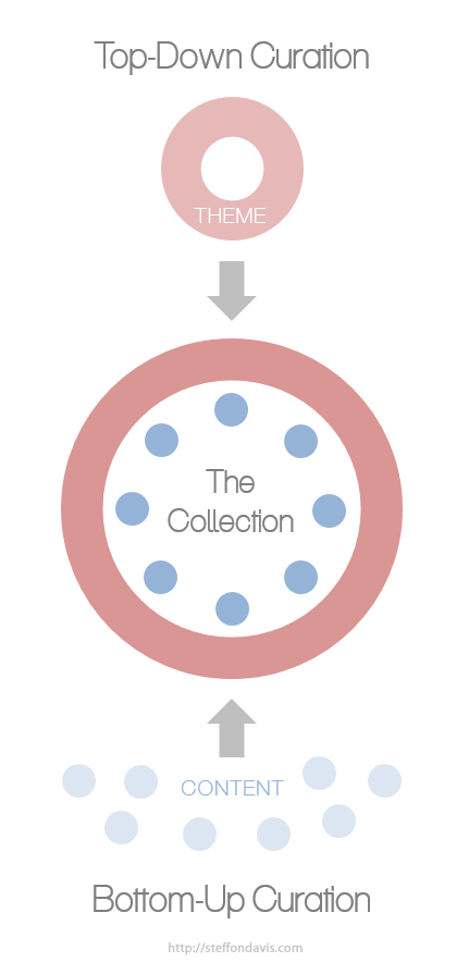
The first addition to any collection can be the hardest. But knowing that I could only win items on my list, I simply added the first thing I liked. Collecting what one likes is a natural place to start and it’s an example of “bottom-up” curation. Bottom-up curation begins with imprecise criteria. It’s an inductive approach that allows one to quickly build a sizable collection and make sense of it later.
Evaluate Everything
While it’s fun to pick out things you like, it can be less fun to comprehensively evaluate every single thing. But it’s important to evaluate everything because an ad hoc process potentially neglects items that should have been included. It’s crucial to evaluate all your options in order to distinguish your collection and avoid embarrassingly obvious omissions.
At the time of the competition, the Square marketplace was organized into categories: home, fashion, food etc. In order to systematically review everything, I opened each subcategory for a total of 65 web browser tabs. I clicked through every page of products on each tab and, with around 8 pages per tab and 21 items displayed per page, there were about 10,920 products that I evaluated. From these, I collected about 40.
Develop a Theme
My collection began humbly as a list of my “likes”— a pair of shoes here, a shelf there… And while the theme was obvious to me (I like all this stuff, incredible!), the pattern wasn’t necessarily recognizable, or likable, to others. The theme needed to be explicit.
A handy trick for theme development is to imagine that you are a playwright and that the list of products are props in your play. Like an improve-comic adlibbing a skit, all you need to do is figure out a story for your props. Try asking yourself questions like, what kind of characters would use these items and in what settings? How would they use them and how does that define their relationships to one another?
My list of “props” contained high-end furniture, clothes and accessories for stylish men and women, and unique apartment fixtures, like an artisanal pipe lamp (which I wouldn’t normally buy). From this, I imagined a young man and woman living in a large city decorating an apartment. To spice things up, I made them a couple moving into their first apartment together in SOHO and added the following title, description, and cover photo to the collection:
Title: Young Couples & Their SOHO Lofts
Description: Your first SOHO apartment as a couple can be OH SO hard. Make life easier with these pieces both of you can agree on.
Cover Photo:

“Top-Down” Curation
After choosing the theme “Young Couples & Their SOHO Lofts”, I reviewed my collection and saw many non-SOHO-esque items. So, I removed them and dove back into the +10,000 product marketplace with a new goal: to find items that, while I may not like as much, are thematic. By curating with a theme, I transitioned from bottom-up to “top-down” curation. Top-down curation is a deductive approach requiring specific criteria.
Start Fishing
Until this point, I had only browsed the product categories provided by Square. But when I searched for a specific product for my collection, to my surprise, Square returned hundreds of uncategorized results. As it turns out, there is a vast number of uncategorized products in the marketplace that you can only find by searching keywords.
While a larger base of items created exciting opportunities, it was also anxiety provoking. It became clear that I wasn’t close to evaluating everything in the marketplace and that I never would.
So I leaned back in my chair, put myself in the shoes of a SOHO couple, and started fishing. Sometimes I searched by materials like “iron” or “copper”, or I would search for specific items like “bathtub”, “boots”, or “stove”. And for each query I would trawl through pages of results fishing for the perfect catch.
Re-Arrange
Collections read like words in a book, from left to right and top to bottom. And like words in a sentence, the order is fundamental to meaning. Unfortunately, there was no way to change the order of products on my list. At best, I could move an item to the end of a collection by deleting it and then re-adding it; there wasn’t any additional re-arranging you could do.

Distill
If an item is technically thematic, but ruins the “flow”, take it out—the collection will be better for it. For example, I had a pair of socks I really wanted to include in the collection: they were hip, cool, and stylish. But no matter how “SOHO” the socks were, they were an eye-sore between the $1,200 armoire and $2,000 mirror.
Visual Integrity
Like paintings in a gallery, the quality of your imagery determines the experience. So if you have a thematically appropriate item but the picture looks bad, remove it. For example, I had a retro red Vespa Scooter in my collection for quite a while. It was definitely SOHO, pricey, and made perfect thematic sense. But the photo looked like something you might see on Craigslist. So despite its relevance as a product, the low-quality photo undermined my theme’s visual integrity. I was forced to replace it with a Scooter that, while I didn’t like as much, was photographed nicely.

Write a Story
Like a comic book with a few lines of dialogue in each frame, captions help tell a story. Each product can and should have a caption that knits a theme and narrative. With my collection nearly complete, I spiced up my captions to create a beginning, middle, and end.
Win

It felt great to curate a winning collection, but it was doubly exciting when my friend won too. I told her about the competition, equipped her with this curation process, and she won as well. Like any skill, you can learn to curate better. I hope you’ve picked up a few award-winning curation strategies for yourself.
Postmortem
Here are recommendations for merchants that want their products curated more often, and for Square to help its users curate better:
Recommendations to Merchants
Take beautiful photos: If the product doesn’t look nice, it won’t get curated.
Provide useful descriptions: help me imagine the product’s potential. It will also help me write my captions.
Do some curation yourself: provide examples that help me understand how this product fits into a lifestyle.
Recommendations to Square
Add infinite scroll: then I wouldn’t have had to click through 520 pages.
Add the ability to rearrange content in a collection: you can’t create sentences without reordering words, and you can’t curate compelling collections without changing the order of content.
Allow users to change their collection titles: at one point I wanted to change my collection title, but I had already posted the link. When I changed the title, my link broke. If you use slugs for your links, people could be more creative with their collection titles without breaking the SEO.
Allow merchants to upload multiple photos so curators can select their favorite: for the merchants who have good photography, they likely have a lot of it. I would have liked to see more images of the same product and curate my favorite.
Did you like this article? Feel free to post a comment or tweet it:
How to Curate a Winning Collection [click here to tweet this message with a link to this article]


